REVERSE EVERYTHING!?!
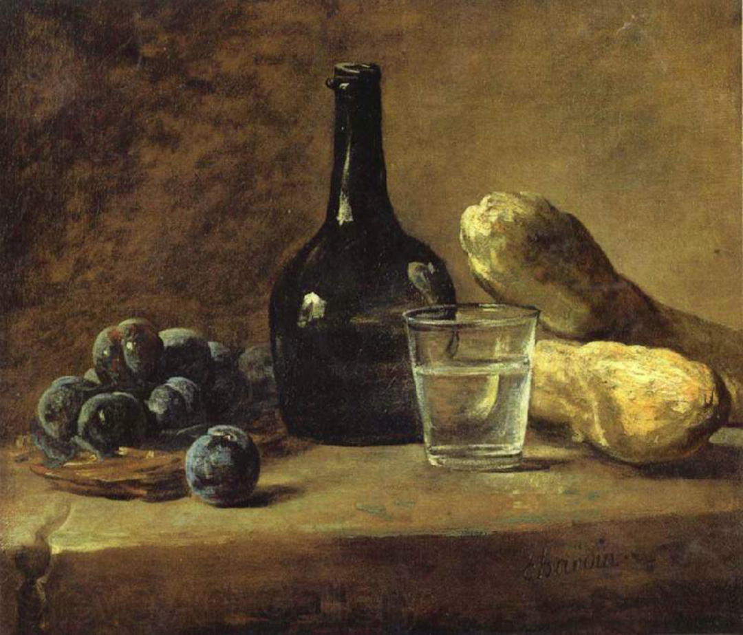
I find that the notion of unfolding* is probably the most important aspect of compositional structure but also the thorniest to communicate. First, because its not easy to understand why it works. And second because it antithetical to everything you think you want a painting to do. Strangely it is the deconstruction of both object and space that creates formal strength and stability. I want to start out looking at this seemingly simple and beautiful Chardin from the Frick in New York.
There are two things I have noticed about a really great painting. One there is always the feeling of space…everywhere, and two, the objects feels complete and tactile. By tactile I mean the sensation of the paint taking on the physical appearance of surface and/or light. (Which is not thickness of paint, although thickness or surface texture is an interesting reminder for the viewer of the reality of the painting as an independent object.)
Chardin’s paint seems to hug and describe the object as if tiny fragments of light and color were bouncing off of it. Yet as you study the formal structure of the painting that sense of solidity is constantly shifting and disappearing. The space and form are full of tension and rhythm, forcing the viewer from one place to another, ambiguous from start to finish.
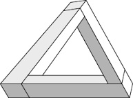
I think you only begin to see this or feel aware of it when you draw from the painting. The sensation for the copyist is of a rhythm that pulls you from one space to another. There is no static resting reality. Paradoxically, the casual viewer experiences a sense of solid objects and open space, it just looks like their own real, visual experience. So the question is, what makes all those little ambiguous jumps from spot to spot hold together as a unity? Here is what my experience has led me to believe: nothing in the painting is logical, every place is transformed into the next, much like the devils triangle reads clearly from one corner to the next and is also completely impossible as a whole.
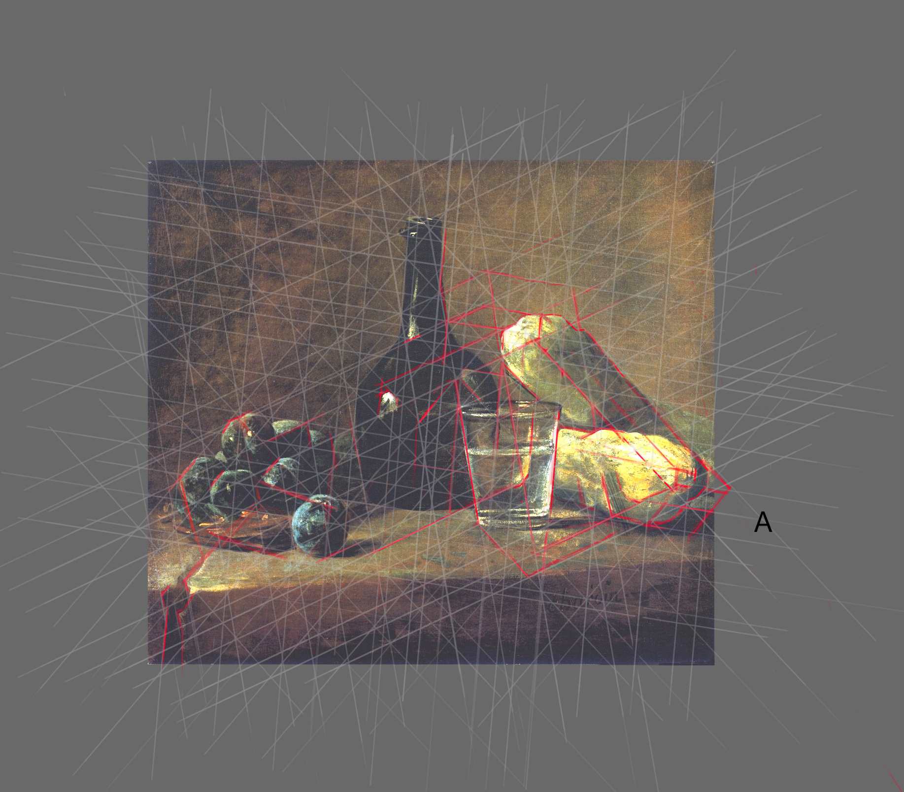
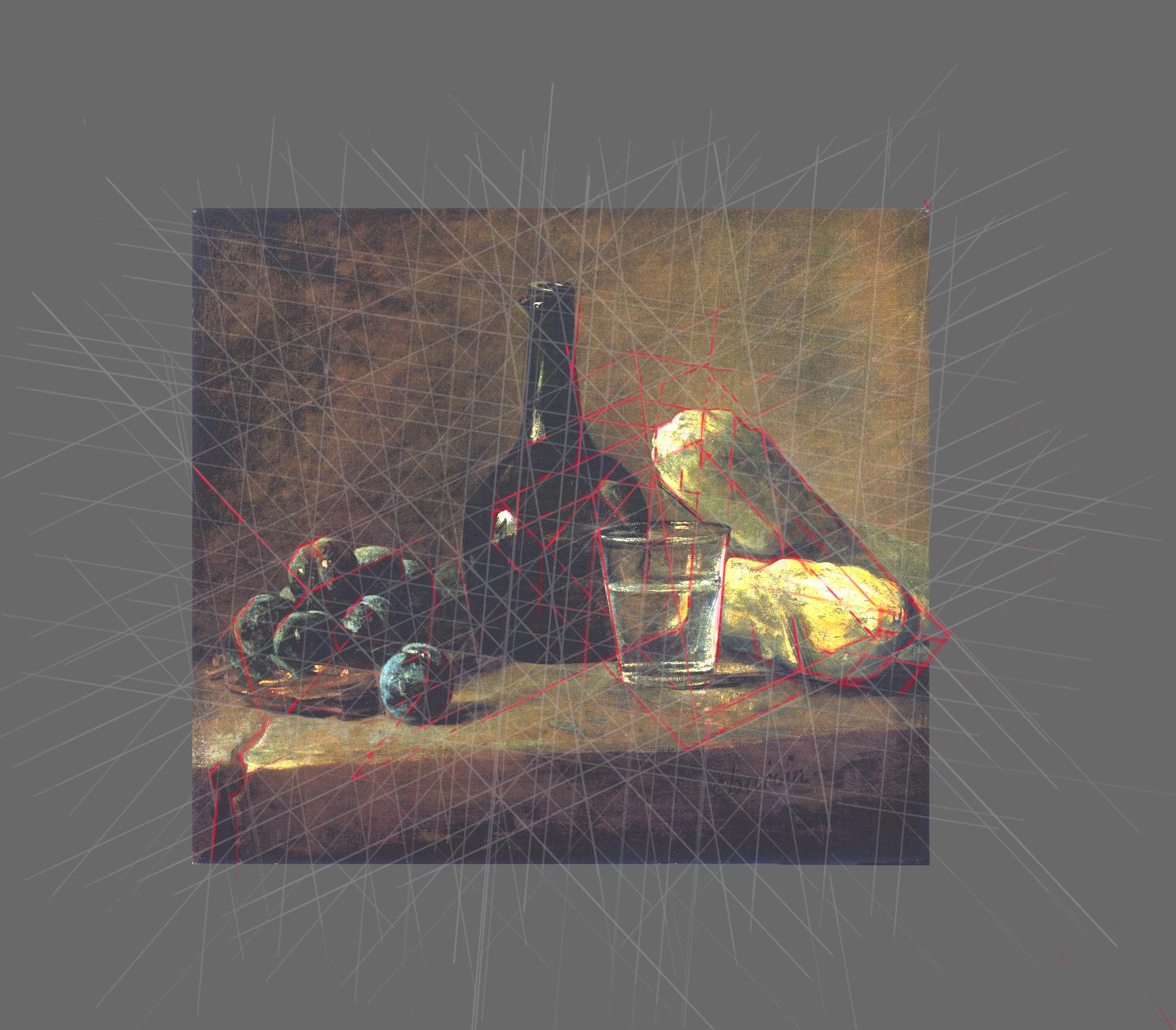
The amazing thing about Chardin is his ability to work out so many small complicated shifts and still hold the painting together as a unified whole. My idea (at this moment in time) is that there are large scale ambiguities (like the devils triangle) that hold the whole space together and the small rhythms are based on this larger formal structure. This structure for transforming is very difficult to think about when you are drawing or painting, my solution is repeating sets of diagonals which I find very helpful for relating the larger hidden structure to the particular. I am going to call it the design matrix. I don’t think Chardin gridded up his painting in this way and there is no historical evidence for it but I feel certain that the grid is evident in the painting and it is very useful. My guess is that some kind of triangular jigs were used in making the painting.
First, lets look at the two squash on the right side. The diagonal line that they share (A) connects and unifies the two squash. But it also transforms a shift from the top front edge of the front squash to the right dark edge of the “on top” squash.
The bending of line A to accommodate both squash creates a visual tension (like the devils triangle) and the viewer is pulled along the diagonal in search of resolution. Only to find herself in a new space with a strong underplane on the “on top” squash that seems to hover over the glass whose shadow then moves up the side of the first squash laying on the table. WOW! And I am sure I am missing plenty of other things that are happening. Next I want to see if I can get over to those plums.
I know this grid of six angles seems very complicated but honestly the longer I look and work into the painting the simpler it looks to me. And I think the finer the grid breakdown, the more likely one can fit observed nature into the structure. (On my way to the plums I noticed how the highlight in the bottle pushes the form to the right and back around the glass and up to the lower squash again.)
But back to the plums. The diagonal of the top squash reaches over to the left to tie into the plum structure. The plums like the squash have an illuminated top plane and shadowed underplane. This puts the diagonal that connects the plums and top squash into tension (which is closer to you, the squash or the plums?). And here is classic Chardin: look at this plum that sits on the table, how it is painted into the grid:
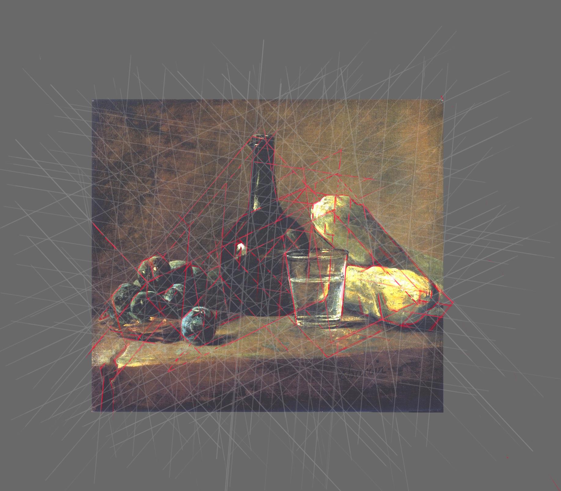
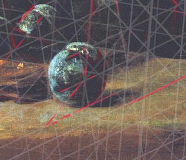 I love that little arabesque at the top of the plum that wraps around the grid stopping at precisely the right spot but also beautifully expressing the form of a plum. At this point the painting is starting to look amazingly organized and unified to me but also falling apart into bits of paint. I have been looking at this one for many years and the strangeness of the bottle is on my mind so I think I will look at that next.
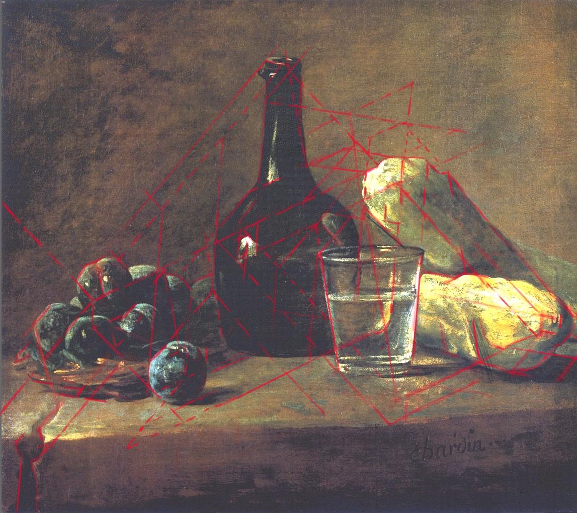
OK this is a crazy amount of information but I can see how the rim of the bottle relates to the left back turn of the basket which in turn goes up to the top squash. So cool! I hope this is as clear to you as it seems to me. The reason I began drawing like this was because when I would do a direct drawing copy I would just end up with the “thing” that I was copying and couldn’t tease things out like this. Layers are a wondrous thing. Even though I haven’t even come close to making all the connections I am going to turn off the grid and see how my red drawing lines look.
Do I think Chardin painted this way? Yes and No, lets just say he could not have just “felt’ such complex relationships and must have had some method of construction. I sure wish I could go back in time, take a peek in his studio and watch him work! One thing that life has taught me is that patience and persistence is a big deal, and I think we can feel that here. If anyone has any ideas about how to make some good jigs……
*unfolding is term I made up to describe the notion that space opens up as a process from one place to another and is contingent on the readers eye path.
Leave a Reply